|
Shade diagrams
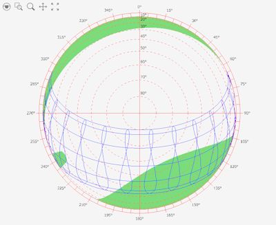
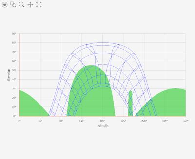
This graph shows the surrounding skyline viewed from a point and the path of the sun, being so able to observe the interference of these charts will help you understand the solar access at that point. Looking at the diagrams, the lines in blue are the path of the sun between the summer solstice and the winter solstice, the areas in green are the obstacles around the point where it is conducting the evaluation. Polar diagram:
XY diagram:
Azimuth and Elevation identify the position of the sun, so that the green areas that overlap the path of the sun indicate the times of year when the point is not reached by the sun's rays.
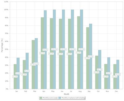
The Monthly solar access diagram explains the amount of available solar energy or insolation in a particular location.
The reported solar access percentages are the amount of site-specific solar insolation available at the location where access was evaluated given the shade-causing obstructions, divided by the solar insolation if there were no shading.
|


